Year
Roles
- Digital Strategist
- Researcher
- UX Designer
- Interaction Designer
Deliverables
- Research
- Wireframes
- Prototype
- Visual Design
Powerpoint. With Extra Power.
This project started out as an ugly-duckling and wound up being one of the most interesting of my career. In addition to testing all the tools in my belt from research to strategy to design, I had to convince the entire team–and the client–that we needed a better solution to a larger, unacknowledged problem.

Where We Started
Michelin’s sales agents are busy people. In a given day, they could be driving 250 miles, giving 5 in-person pitches, calling 20 perspective clients, and trying to read up on the latest products from the head office. But the worst part of their day was dealing with marketing assets and powerpoint.
You see, every time a new product launched, the marketing team would email out the details to all their agents—images, white papers, specs, safety information, and performance information. The agents would then take these assets and dump them into powerpoint, creating custom presentations for their upcoming pitches.
You can imagine how time-consuming this was for agents: searching through their email to find information, worrying about which version was the most recent, wrestling with PowerPoint, and then when they arrived on site, they might only get a fraction the promised time if the client was busy.
Michelin asked us to create a database for their marketing assets, so agents could search and find all the most up-to-date information on the products in one, central place. Spoiler alert: that’s not what we wound up building.
Step 1: Initial Research
The kick-off to the project was less than ideal. The project manager flew down to South Carolina while the rest of us listened over the phone. The stakeholders walked us through their needs and a description of what they wanted, after which there was an hour-long roundtable with a number of agents. I vividly remember desperately slacking questions to the PM to try to get the most out of these sessions.
The next day, as I summarized the information, I was hit with a sudden realization: while I didn’t have access to exactly the right users, there was a group of very similar people sitting right down the hall: the salespeople at my digital agency. I conducted a series of impromptu interviews, watched them create presentations, then went back to my desk to reflect on it all.
Initial Findings
-
Finding the right information was time-consuming. But assembling and styling the presentations took much, much more.
-
Duplicate effort—people were creating nearly identical work because they didn’t know or access the files that other’s had created.
-
The presentations being shown to clients were wildly inconsistent. The Michelin agents generally lacked a deep understanding of design and their experience with PowerPoint was limited.
The Big Idea
What if we were able to create a platform that removed all the pain that came with styling a presentation? What if we leveraged the closed ecosystem and inherent hierarchy of a presentation to understand the relationship and context of when content was used, to make assembling new slides and sections a snap? That is: could we fake Artificial Intelligence to make on-the-nose recommendations using a systematic (and hidden from the user) series of tags?
If we were able to do this, we could fix the larger problems faced by the agents and make assembling pitches an afterthought instead of a laborious time-suck. Our platform would have the added benefit of allowing the marketing team invaluable data on what information which clients were seeing, and tracking how that impacted sales. Did safety track better with mid-sized dealerships in the Midwest versus performance?

Step 2: Reset the Project
I was really excited about the new idea, but there were a few problems:
- I wasn’t actually sure if this idea was possible and whether it would make sense to users.
- Our Statement of Work was for something very different—to pull off this new focus, I’d have to convince everyone from the team, to management, to the client.
- The client needed an initial working version in just 6 weeks for the upcoming agent-training sessions.
I pitched the idea to the team as a hypothetical—it was important that I get buy-in from the people who would be on the hook for delivering this concept: they were all onboard, thrilled that what had been a fairly low-profile, dull project had the chance to transform into something truly innovative.
With the team in my corner, I proceeded to pitch the idea up the ladder, first to the Creative Director, then to the head of the agency. Finally, it was time to ask the client. I prepared two quick prototypes—one showing the database they’d requested, and another showing in broad strokes how the new idea might work. I’ll never forget the awe and excitement in the client’s voice when what we were offering clicked. “Oh my God—this is amazing!!! How do I get this???”
With everyone pulling in the same direction, it was time to get down to work.
Step 3: Iterate, Test, Repeat
For the next three weeks, my days were a steady rhythm: early morning meeting with the team, prototyping out the next user-flow, then testing twice a week. The engineers were already building, so there were frequent check-ins to make sure were all on the same page. I was also involved in many conversations about how we’d scope out our work—making sure we could get something valuable ready for our initial release just a few weeks away.
The basic flow we settled on was this:
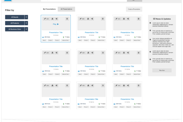
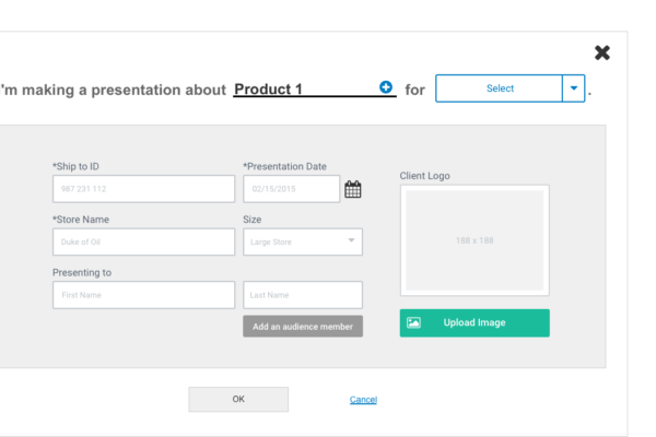
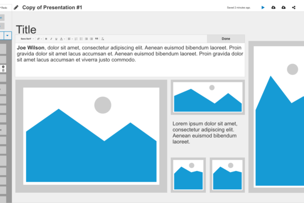
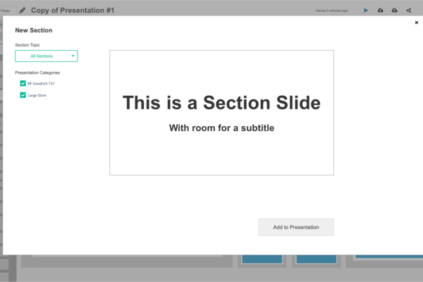
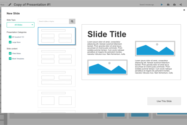
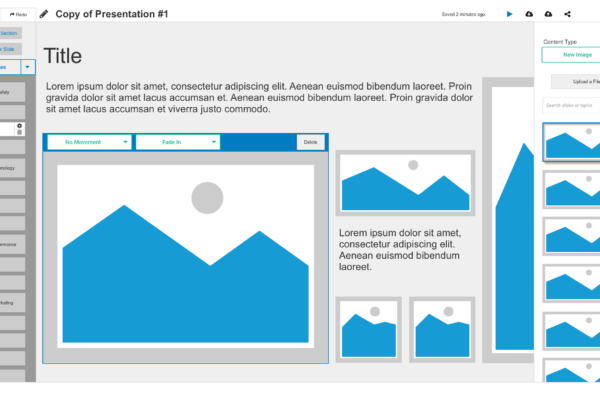
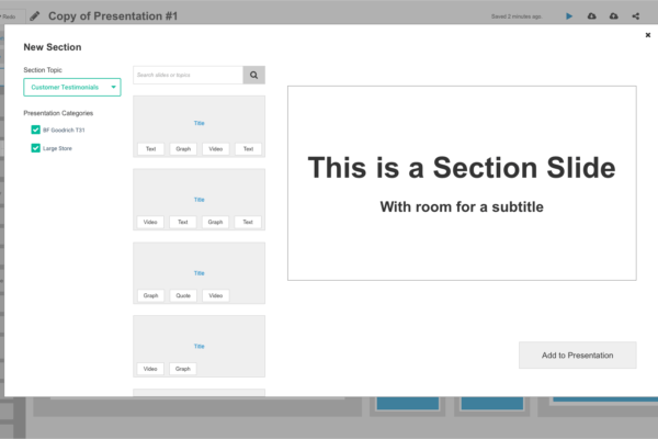
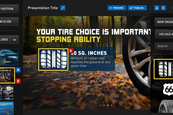
Users entered some information about the name of the client and the products they wanted to pitch. A ready-to-go presentation was then pulled up, with sections that dealt with sales, performance, and safety. Users could quickly adjust these—if they wanted a new section, they could instantly pull up other sections that had been used in other decks for the product. If they wanted to swap out an image, they’d be presented with the list of images that other users had added to that slide, section, and deck.
When they were ready to present, they could swipe back and forth between slides, and up or down between sections. They could even pull up time parameters that would adjust the presentation length on the fly based on the changing availability of their clients.
Quotes from Users
Sample Wireframes
Step 4: Visual Design
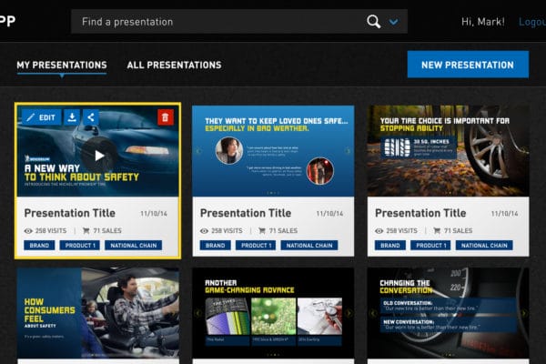
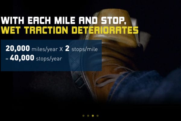
When we’d completed the main user flows, tested and re-tested, it was time to move over to visual design. In this area, it was important create templates flexible enough to support a wide range of information, while still adhering to Michelin’s brand, and looking great. Visual design took about a week and a half from start to finish.

Sample Designs
Wrapping Up
While I left the agency just before the launch, the project was a huge success for Michelin and the agents. The team was able to deliver the project on time and on budget, despite our rather radical change of course.
While I wished I could have had more access to the end-users during my design work, it was fortunate I was able to lean as heavily on our in-house sales team as much as I did. Finally, this was a true team effort. A strong design process revealed a better solution, but we would never have been able to create something so impactful without the flexibility, support, and buy-in of the engineers, the project manager, management, and of course, the client.

