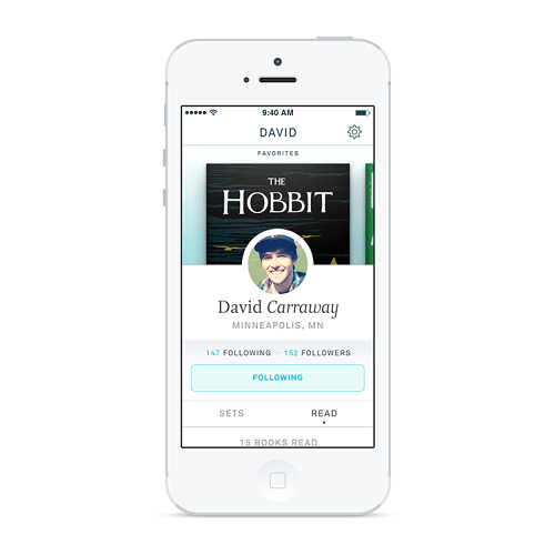
 I came across an article that analyzes some of the design solutions that the App “Oyster” proposes to resolve mobile reading issues. While I disagree that any of them are major, there is certainly some interesting stuff, for example:
- Showing read progress in a vertical progress bar (not really sure why this is preferable to a horizontal bar–I associate left to right with progress much more than top to bottom. Also, seems like it could be tricky to grab the tiny scroll handle).
- Breaking pages into chunks of text and replacing page turns with continuously scrolling chunks.
- Additional fonts and styles to accommodate reading under different use-cases (low light, etc.).
- Subscription ebook service.
Unfortunately, the users and user needs for the Bookshelf App I’m working on are much different from theirs, so it’s unlikely that many of their solutions would work for my app. But it’s always interesting seeing how other people approach projects and it’s certainly a great looking product.
