 Many of you might have noticed that Google has undergone something or a radical shift in its design over the last two years. As recently as 2011, the company, though thriving, was known for providing utilitarian, if ugly, products. Even their signature homepage was ugly.
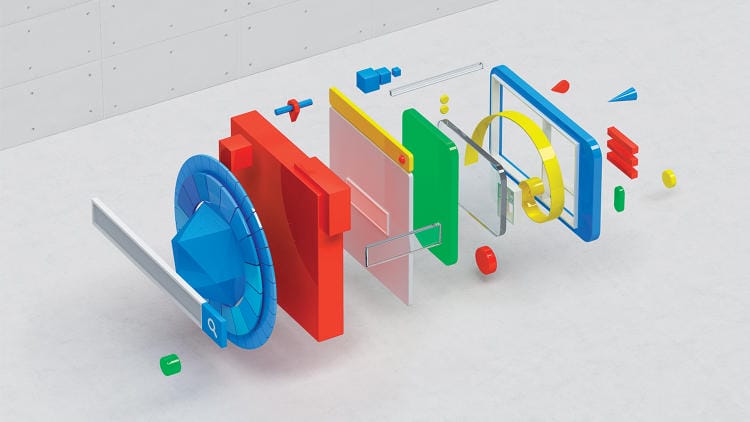
Lately, however, the company has been releasing products that aren’t just smart and innovative, but beautiful. Their mobile apps in particular have an esthetic that puts many native Apple apps to shame (Google Now and Google Drive immediately spring to mind). This is far from accidental. When new CEO Larry Page took over in 2011, he mandated a new policy and structure that put design and user experience first.
He brought the many different designers at the company together and asked them to decide how Google should look. The team not only overhauled Google’s design, but set-up a loose governance committee (called the User Experience Alliance) that takes a unique approach: rather than simply handing down style decrees, view it as a general set of guides that can evolve when better ideas are found.
It was the design team, not the developers as was traditional at Google, who were charged with creating Google now. It shows. Google Now is a product that harnesses the power of Google in their search capabilities, user data, and geographic data into an interface that is easy, predictive and beautiful.
Fast Company outlines the switch in an absolutely amazing article–maybe my favorite of the year so far.