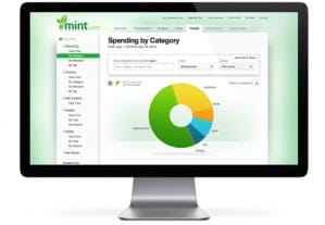
 The very nature of insurance means that much of my design work deals with large sets of numbers, trends and complex transactions. As a result, much of my essential function is to find ways to make that information easy to understand. The easiest way to do that is through a dashboard.
But how much information is too much? When should you use a chart as opposed to a table?
An article from UX Magazine outlines the core concepts behind effect dashboard design:
- Allow users to be in control. Make sure users have the information they need, show them what’s important, and allow them to act on it.
- Avoid dependency on short-term memory. Use graphs and charts rather than many numbers and cut all unnecessary information.
- Let users drill-down to see more detail as desired
- Group related information together and split other information across tabs.
- Make it easy to use.
The article goes a bit deeper on each of these topics, and highly recommend giving it a read.