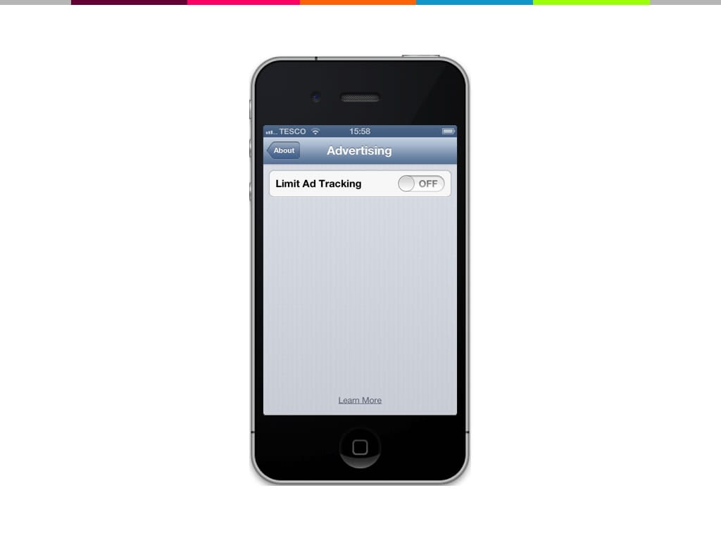

iOS buries the option to limit ad tracking–AND phrases it confusingly.
I came across an article from 90% of Everything that discusses “Dark UI Patterns” at length, and I thought it was important to share. “Dark UI” is when design is used to purposely confuse users into doing something which they don’t want to do–it’s usually done either for profit or to game an inaccurate metric that the business has decided is important. An example is a site that automatically signs you up for a mailing list when you open an account. Sure, you get more subscribers–but are they going to people who are actually going to read it? Or will they be angry, bash you on twitter and cancel their accounts?
The article gives a bunch of examples, showing violators from Apple, the Ladders and others–showing that now and then everyone is tempted by the dark side. Even the British hospital system is guilty of it with the invention of the “Hello Nurse.”:
In the 90s, the hospital board decided that patients were waiting too long to be seen to. So they issued a mandate that all patients must be greeted within 5 minutes–now greeted, is not the same as treated, so the reaction of the supervisors was to hire new nurses whose only job was to walk around and say hello to patients. They met their quota, everybody wins, right? Of course not. The treatment didn’t actually get any better or faster. It was a trick used to hit a metric that showed a lack of understanding about what was actually important.
The point of all this is not to say that we should look out for these practices in our designs: I don’t think that we’re guilty of this. It’s to 1) be vigilant about what metrics we consider to be important and makes sure that they actually describe reality and 2) be vigilant of pushing project and business leaders to be more concerned about hitting their actual goals rather than an easy-to-measure goal.
Join the discussion 2 Comments