Year
Roles
- UX Researcher
- Digital Strategist
- UX Designer
- Visual Designer
Deliverables
- Research Findings
- Wireframes
- Prototypes
- Visual Design
Rocketrip Rebooking Flow
Rocketrip is an enterprise service that allows business travelers to split savings with their company. We accomplish this through a stand-alone web application as well as a browser extension that overlays information directly onto booking sites, letting users know how they can earn rewards.
This project, however, focused on providing value to users without using any of our platforms. We set out to answer the question, “What if we could convince someone to change their behavior after they’d booked their trip?”
The Problem
Some users who hadn’t activated their accounts were booking trips that had huge opportunities for rewards. This was a problem for travelers (imagine missing out on thousands of dollars because you didn’t activate your account) and companies (users weren’t saving money).
However, it was also a huge opportunity. I was on a small team tasked with looking into the issue.

Research
To get a better understanding of our users, their needs, and their workflow, we scheduled phone calls with 10 users we selected based on frequency of travel (we wanted a mix of road warriors and people who only infrequently take business trips) and level of engagement (both people who used our platform and those who didn’t). Our calls were casual, 20-minute conversations where we asked about their behavior, walked through their process for planning and booking a trip, and talked about some of their motivations.
-
Users were open to being contacted about opportunities to earn additional rewards.
-
If it was easy to do, users were open to making changes to trips they’d just booked.
-
Users needed much more incentive and information to change flights as opposed to hotels.
The Idea
Based on the research, the project focus and scope evolved organically through conversations with myself, the PM, and our engineers. The idea (dubbed Goldfinger), was to reach out to users if there was an opportunity for them to earn substantial rewards and make the requested changes for the users.
Let’s Get Started!
We decided to initially focus on flights. When a user booked a trip with a business class seat, we’d identify similar flights (or even the same flight) with available coach seats, and reach out to them about the opportunity. They’d then be able to review the details of the new flights, and if they agreed to switch, we’d contact their booking agent and get it done. Even though research showed that flights were the more challenging of the two, we decided on this approach because it offered the biggest savings for companies ($2,000 average) and the largest reward for travelers ($1,000 average).
To get everyone aligned, I first sketched out a very rough user flow. I wanted to make sure we all understood how this new idea would fit in with the existing experience. I then began experimenting with how to guide users through this flow using very fast and crude wireframes.
Test, Iterate, Repeat!
Round 1
After a few rounds of iteration based on conversations with the team, we had a flow that we were fairly confident in, however we quickly realized that the biggest threat was understanding how much information users needed throughout the process in order to feel comfortable changing their trip. To test, we created three different versions and tested them through unmoderated, online sessions.
Round 2
The first round of tests not only revealed a winning direction, it also raised two new issues that hadn’t occurred to us: 1) it wasn’t enough to simply offer to switch someone from Business to Coach—without the ability to select their preference for seats, they wouldn’t proceed. 2) Some of our language around rewards was causing confusion and lowering user confidence.
Round 3
After investigating we determined a possible workaround for the seat selection issue: we’d allow users to select Window or Aisle, then forward that request to the travel management company for booking. If the requested seat wasn’t available, the agent would then reach out to the traveler for further instruction. We also strengthened the copy to help address issues around reward changes and the transaction.
Visual Design
With our last round of testing receiving high marks, we moved on to Visual Design. This isn’t always needed at Rocketrip—many products can be built based on wireframes and our existing component library and style guide. However, This project required the creation of some brand new reusable components.
Over the course of about a week, I went through a few iterations, making sure they were consistent with the over-all brand look and feel. These iterations were shared with the PM, developers, and our marketing designer. When we’d arrived at a polished version I was happy with, I moved the new designs in Zeplin to make hand-off as simple as possible.
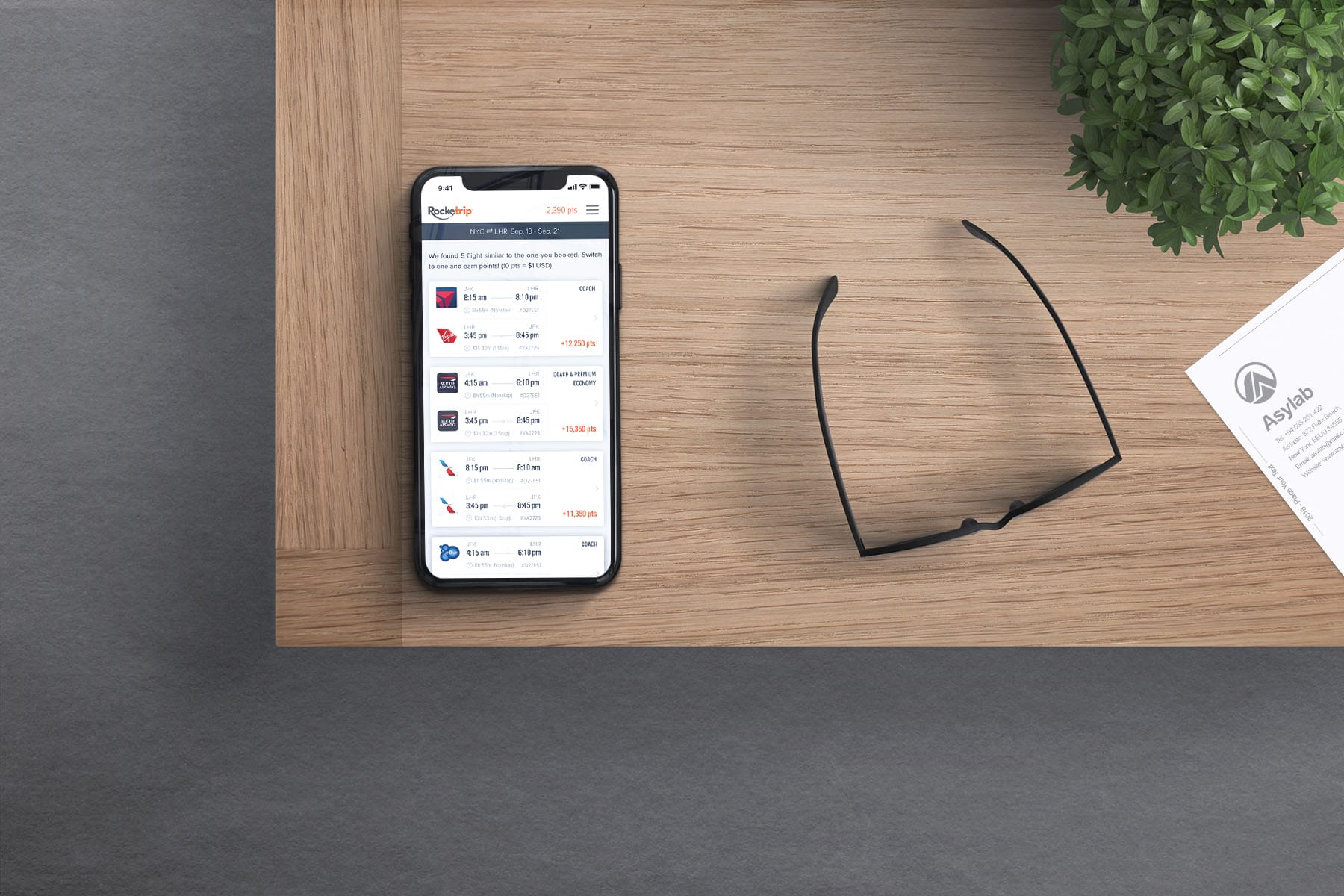
Sample Final Designs
Project Stats
The process was product design as it was meant to be. The team identified a problem, researched, identified a possible solution, and through iteration and testing, built an MVP. When we rolled out, we saw an immediate impact: 10% of all targeted users signed up for Rocketrip and rebooked their trip. Best of all, the average savings for each trip was over $3,000, while users pocketed over $1,500 in rewards.


