Rocketrip
Year
2016
Roles
- Digital Strategist
- Researcher
- UX Designer
- Brand Designer
- Graphic Designer
Deliverables
- Research
- Wireframes
- Interaction Design
- Brand Guidelines
- Visual Design
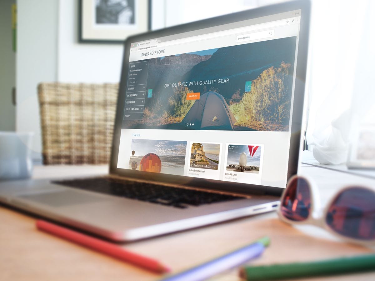
Rewarding Business Travel
The Rocketrip travel platform gives business travelers a precise estimate of what their trips should cost, and a real reason to spend less. Using historical and real-time market prices, as well as behavioral information and the company’s travel policies, Rocketrip gives travelers a precise amount of what their trips should cost. For every dollar they save, they keep 50 cents. Companies save, employees earn rewards. Everyone wins.
Rocketrip has been featured in Forbes, Bloomberg and the New York Times for their unique approach towards driving company travel savings.
Where We Started
When I was brought on, lack of design was holding the product back in a few important ways:
First, the product was not very intuitive. On both the micro and macro levels, users were too often confused about what they were supposed to do, when to do it, and where to find the information they needed. Customer Support was shouldering the work that a well-designed product should be capable of handling on its own.
Second, the product lacked a cohesive design system. Besides the sloppy appearance, this often contributed to disorganized pages, as there wasn’t a principle governing when to use which font size, which color or which component.
Lastly, the product didn’t have a clearly defined “character.” There was a general whimsy to the existing design, but it clashed with the soul of the app: help business travelers make better decisions. Overly exaggerated corner bevels, large cartoonish icons, overly large and bold fonts, and a weak, inconsistently applied color palette seemed at odds with the purpose the product served and the users it hoped to attract.
Objectives
- Improve the existing flow to better guide users through the process, from booking a trip to redeeming rewards.
- Improve the information architecture of the pages, making it easier for users to find the information they needed.
- Create a scalable, logical design system that supported the IA and made creating new components, pages, and designs a matter of applying principles.
- Create a new look and feel that better supported not just the existing product, but set the stage for the identity into which the company was growing.
Phase 1: Research
Over the course of three weeks, I sat down with nearly everyone. And I do mean EVERYONE. Executives, support staff, developers, salespeople, users, project managers, data analysts, travel administrators–everyone who contributed to, touched or managed the products. The goals were:
- Understand what the product was doing well.
- Understand where the product was falling short.
- Understand the relationship that people had with the company and the product.
This information was invaluable and proved to be the building blocks for project requirements and brand identity, and often led to suggestions that I talk to people I hadn’t previously considered.
I also began looking at any examples I could find of travel, dashboard and analytic designs. I scoured google, dribbble and behance, looking at the different ways designers had attempted to solve some of the problems facing the product. I wound up with a large number of pinterest boards drawing examples from everything from banking to smart home to coffee.
“People will say they want a waffle maker in their car when what they mean is they need more time to eat breakfast.”
One of my favorite UX-isms
Phase 2: Iteration
I believe in transparency when designing, but with this project, it was especially important to achieve buy-in across a huge number of stakeholders. A thumbs down from any department could potentially sink the whole project. So how do you please a huge range of people? You turn them from deciders into contributors.
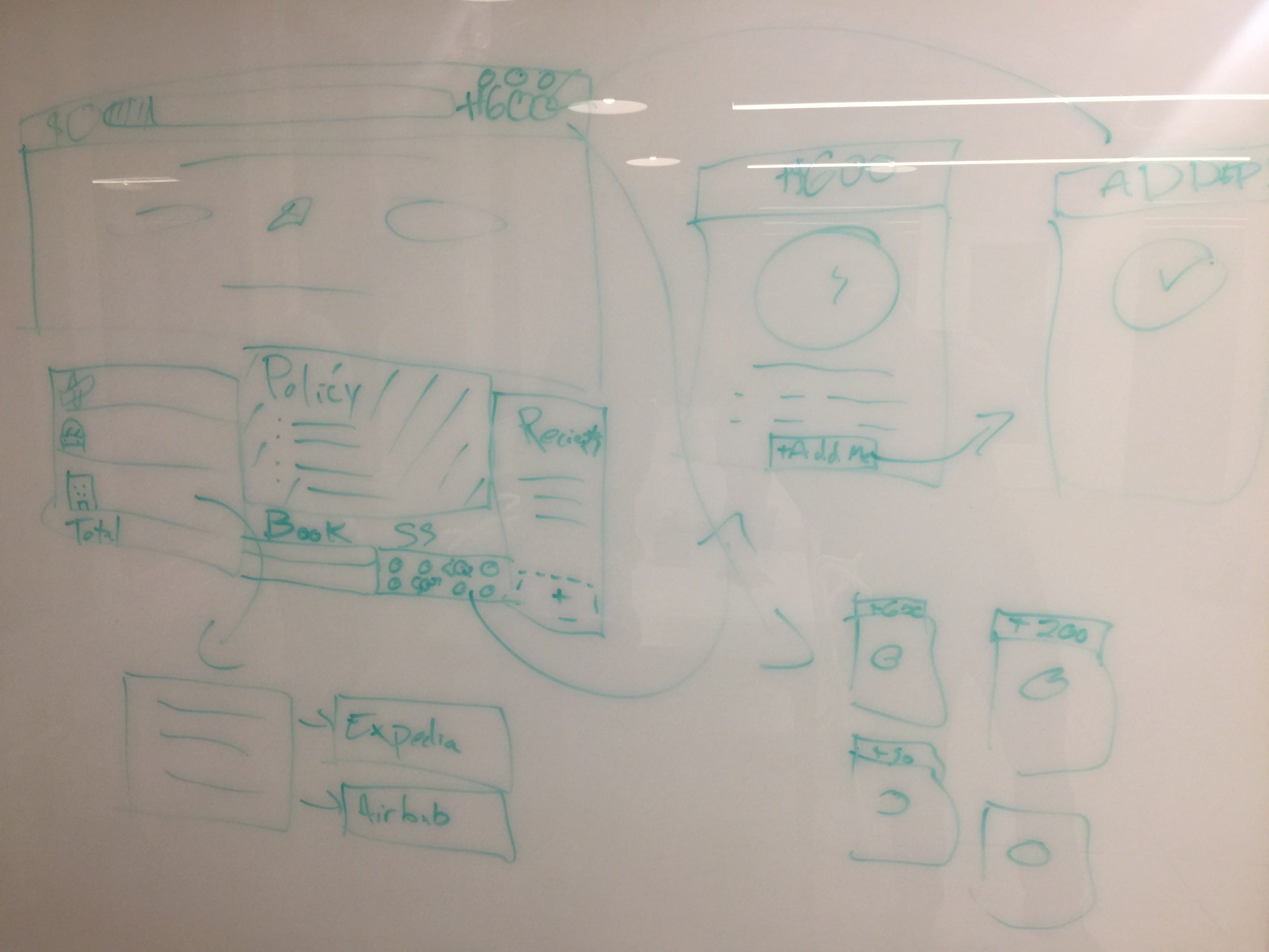
I set up meetings three times a week, inviting representatives from each department, making sure that an executive was present at each meeting to act as the ultimate decider. Each meeting was a live requirements-gathering and wireframing session. I would lead the discussion, record notes, sketch out ideas, then go back and refine the ideas to present at the next meeting. Gradually, through constant iteration, wireframes for the new design emerged. It was a process that worked very well–with one notable exception.
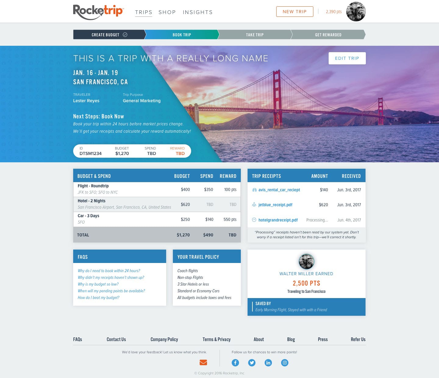
Try as we might, we were unable to arrive at a design or consensus on the Trip Details page. This was not surprising–it’s by far the most complicated and unique page in the application, needing to provide a huge amount of information, clarify a strange review process, provide trip budgeting details, motivate people to change their behavior, and provide itinerary information. There was no way to create something that complicated through live-wireframing. It was time to Sprint.


 copy")


Phase 2a: Sprint

I’ve led Design Sprints for a number of different products and organizations. Overall, I find them incredibly effective at solving thorny design problems when there’s proper organizational buy-in. Fortunately, with both the Head of Product and the V.P. of Operations onboard, the Rocketrip team was in a great place to run a Design Sprint.
Going in, we knew the existing page was confusing and problematic, generating more support requests than any other part of the platform. There were two main reasons for this. First, the existing page provided a ton of information about how your budget was generated, but very little about what you should expect next–it left users uncertain of how to proceed. Second, some of the information that was provided was only relevant to users during specific parts of the process.
The key to cracking this came when we were looking at some outside of the box examples, and I pulled up some check-out flows from Apple and Amazon. Suddenly, it became clear that rather than thinking of the page as a record or receipt, we instead needed to treat it as a flow, guiding users through a multi-step process. It sounds obvious and simple, but the challenge was in agreeing what steps made up the flow and what information could be cut from which views.
Over the course of a week, a team of PMs, Developers, Designers, and Customer Support Reps heard from users, subject matter experts, and executives about the problems we needed to solve, iterated on multiple ideas, reached consensus on a best approach, built a prototype, then tested our idea with live users.
The prototype we tested proved that we were on to something. In testing with both power users and inexperienced users, the feedback was positive. However, it was clear that further tweaks were needed.
It was grueling, but incredibly rewarding five days. And while our prototype wasn’t a home run, it did illuminate the changes we needed to make and provided alignment for the team about the way forward.
Phase 3: Branding
Following the Sprint (and a few days of clean-up), we had wireframes and specifications for every major page in the application. However, before I could start creating a Design Language, I needed to understand the identity of Rocketrip–not just who they were and how customers viewed them, but where they wanted and needed to go.
Fortunately, the research phase involved a lot of discussions about just this topic. I augmented my findings with a brand survey, which I sent out to many, many people:
https://ehren.typeform.com/to/vy4vW9
With this information, I called the executive team together, walked them through the results, and quickly reached consensus on the direction we needed to go: professional, trustworthy, approachable (as opposed to friendly), and innovative. Based on all this, I worked through a series of moodboards to hone in on the correct tone, augmented with pinterest boards displaying individual aspects of the brand as I understood it.
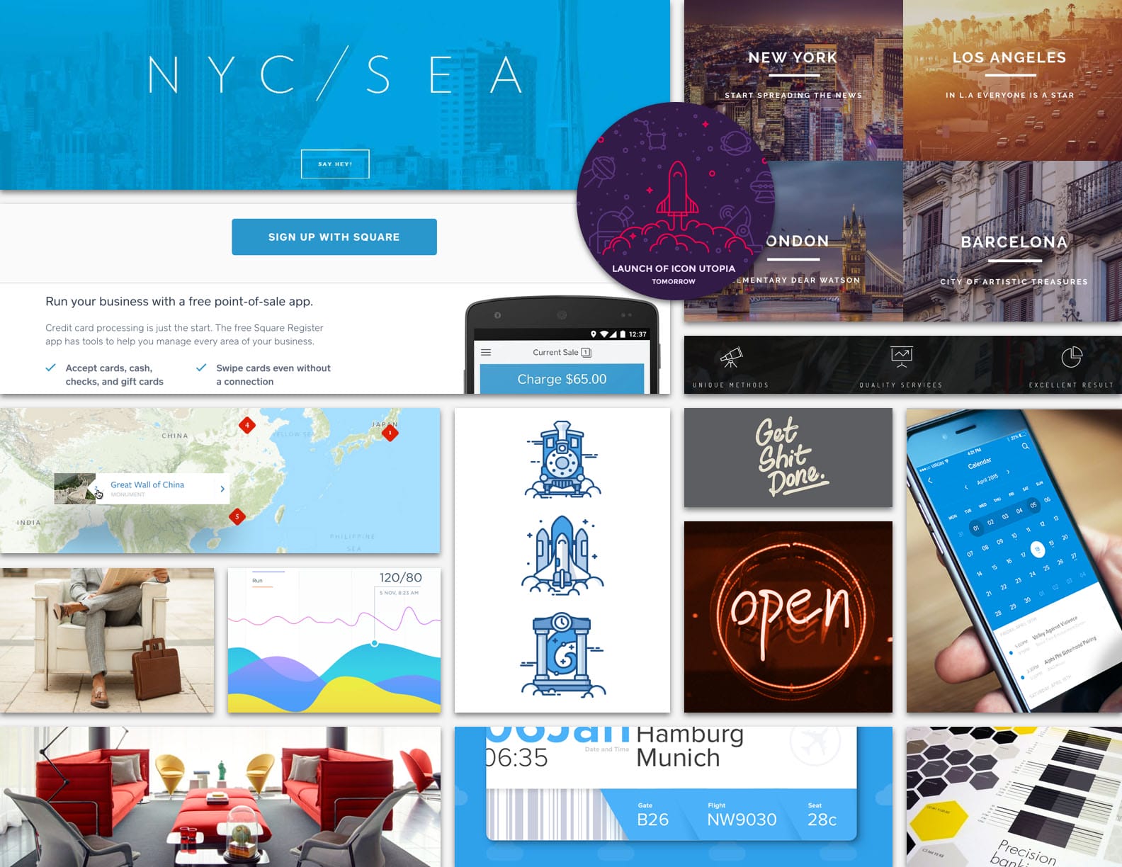
Moodboard from our branding sessions
Phase 4: Visual Design
Ultimately, the executive team decided to hold off on a comprehensive rebranding, which would have required much more time and work. The logo, the core font (Proxima Nova) and orange brand color would remain untouched for the time being. However, I was given the freedom to tweak elements to bring them inline with the new direction.
I worked from both ends at once–starting with small, individual elements (buttons, font styles, form elements, etc.) and immediately applying them to complete pages and artboards. The “molecule” work helped establish a repeatable design style, while the pages, allowed me to assess whether the sum of the parts was adding up and capturing the desired identity.
Version 1
Iteration 1 made it clear that we needed to adjust our color palette, and move farther away from our existing brand and layouts. A much-improved icon library was moving in the right direction. Photography was something new to the platform, and while we liked the idea of duotone, we found it didn’t support the look and feel we wanted.
Version 2
Iteration 2 was better, used images a bit more effectively, but ultimately lacked the attention to white space and feel of sophistication we wanted. The icon usage was too heavy and the fonts were limiting. While the photo usage was better, it was distracting from rather than supporting the rest of the content. We were slowly making progress.
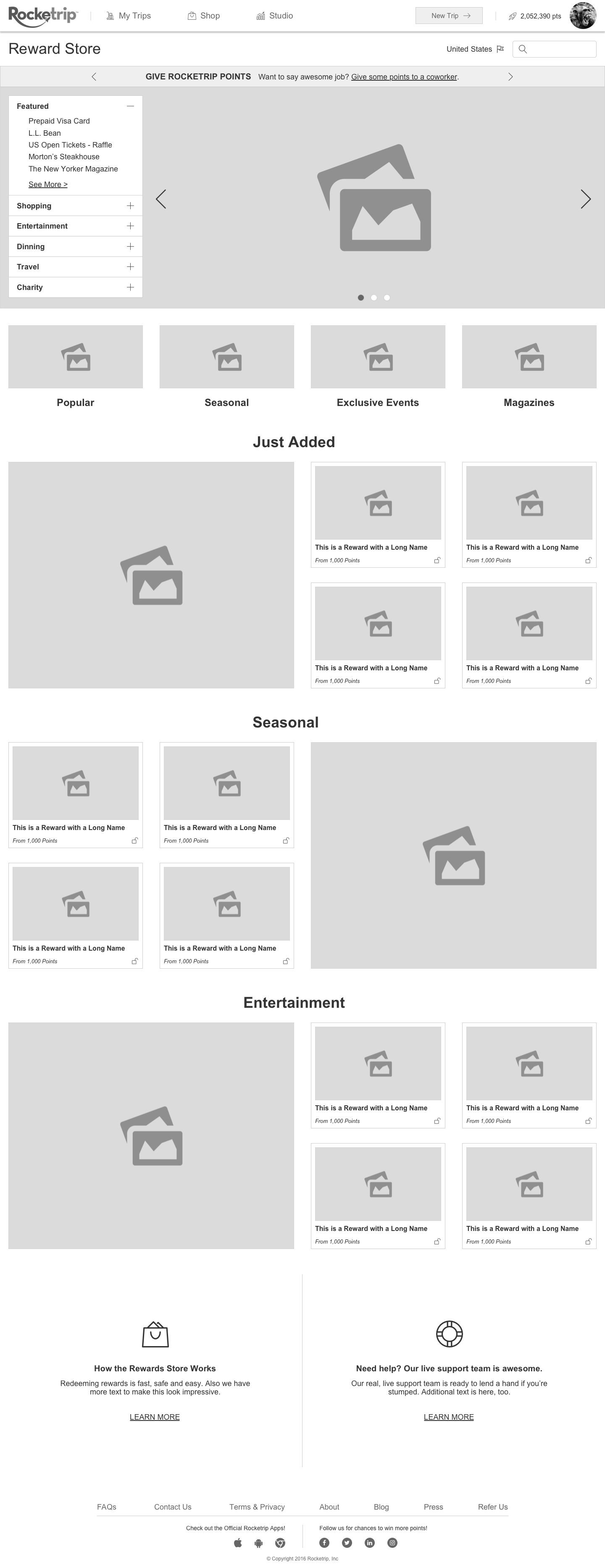
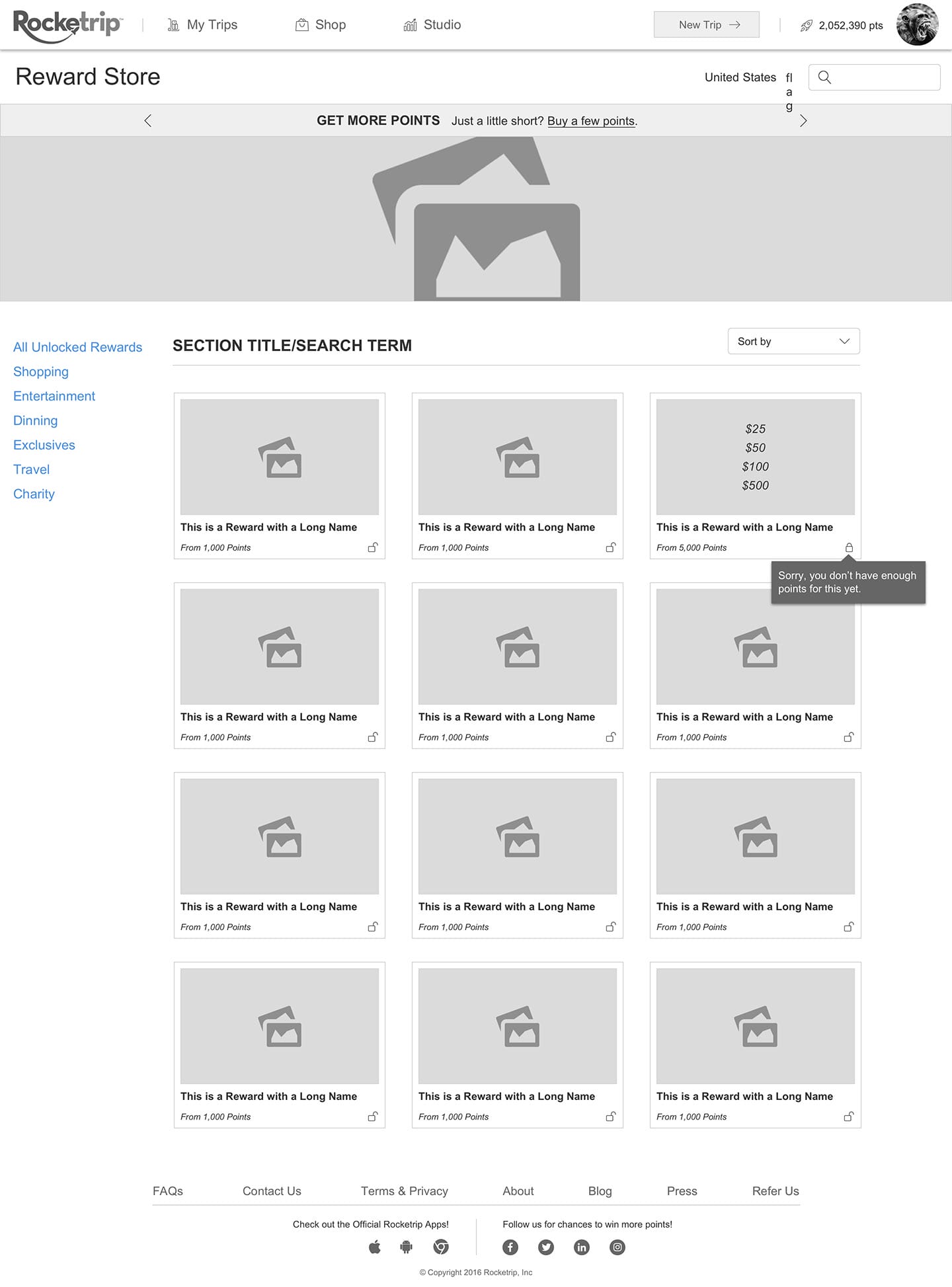
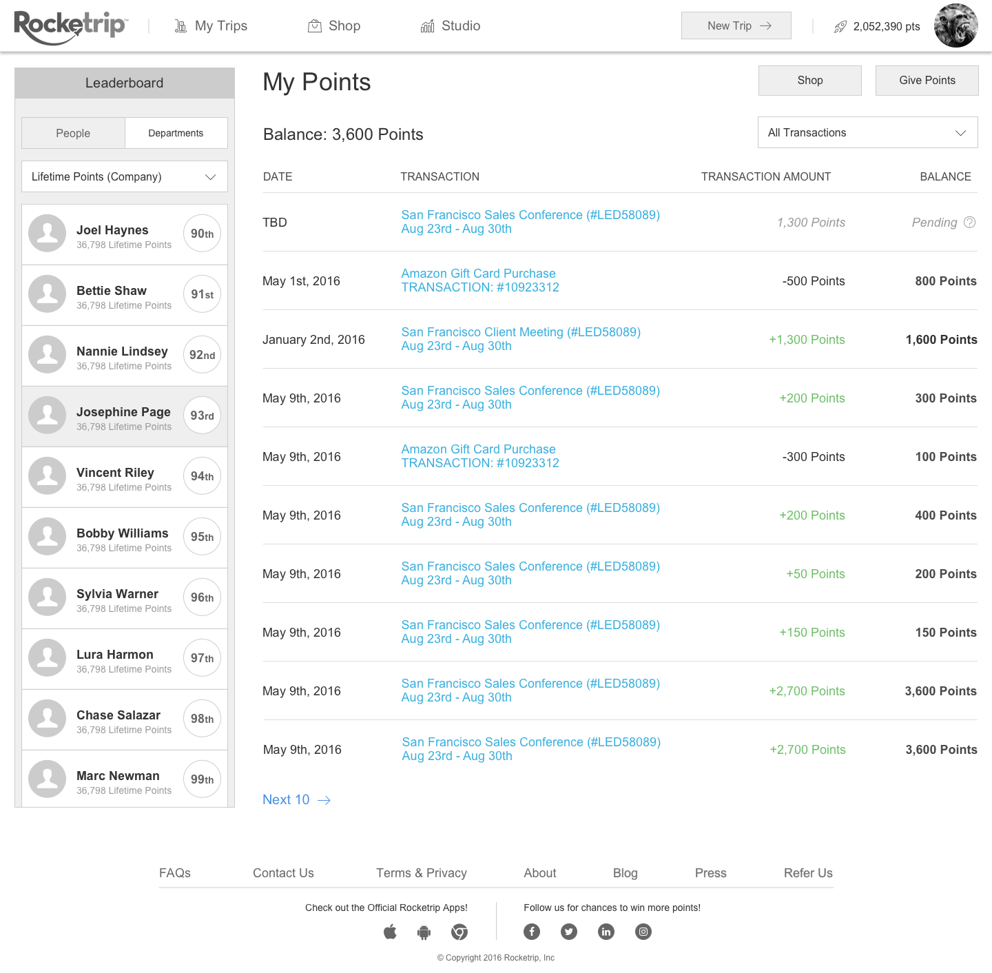
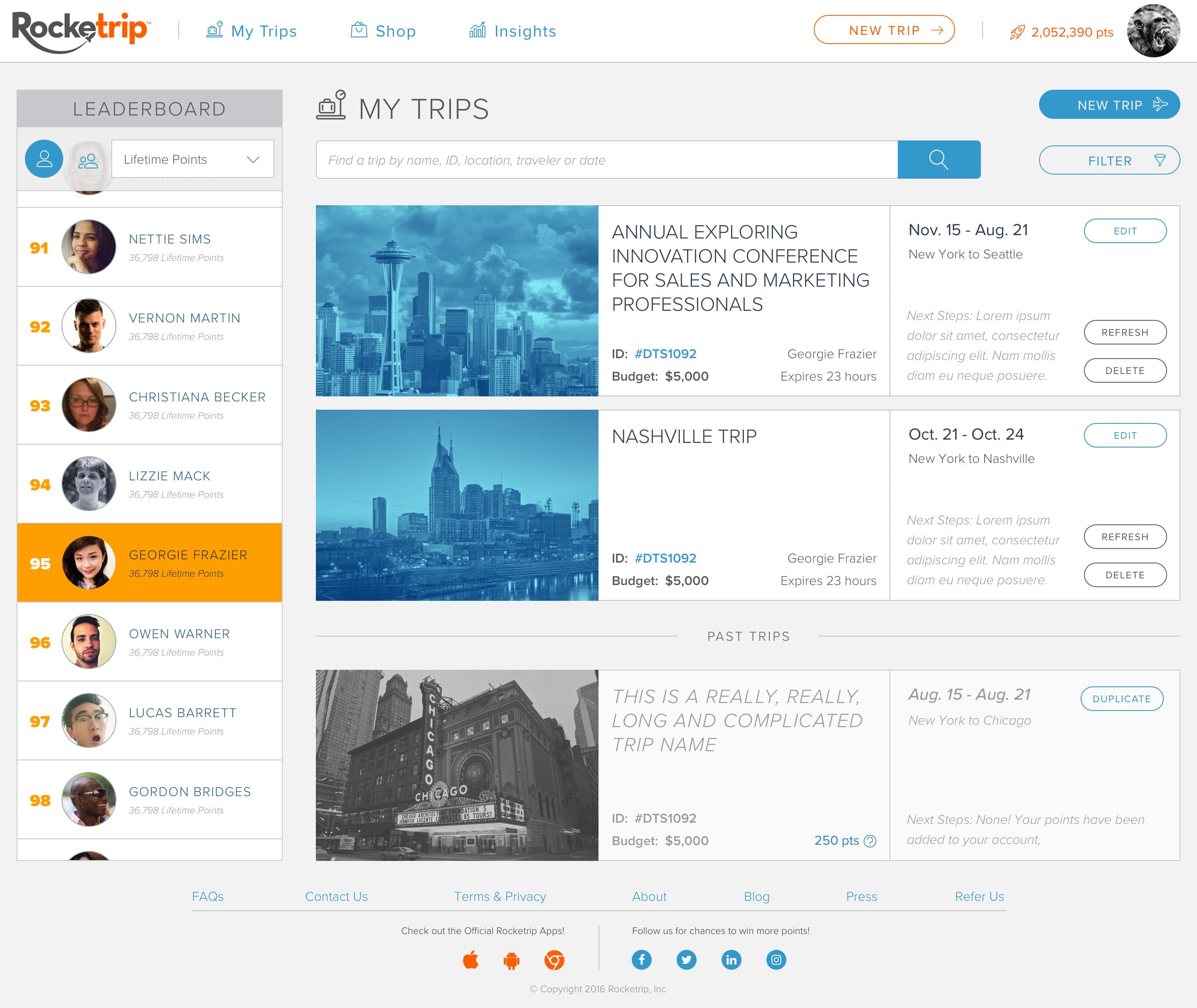
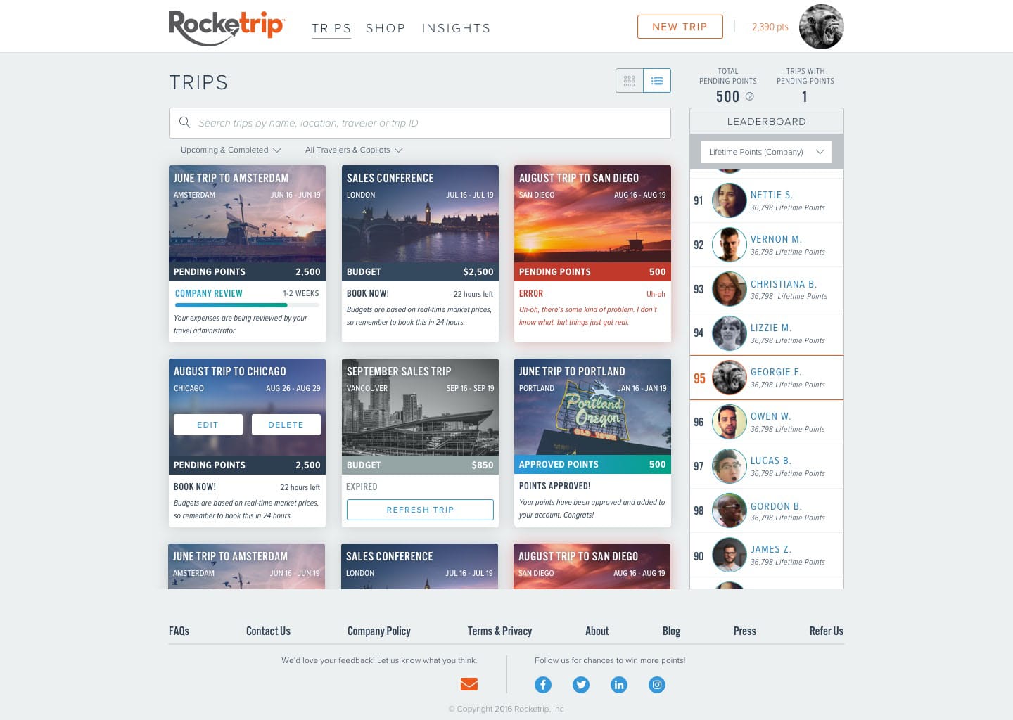
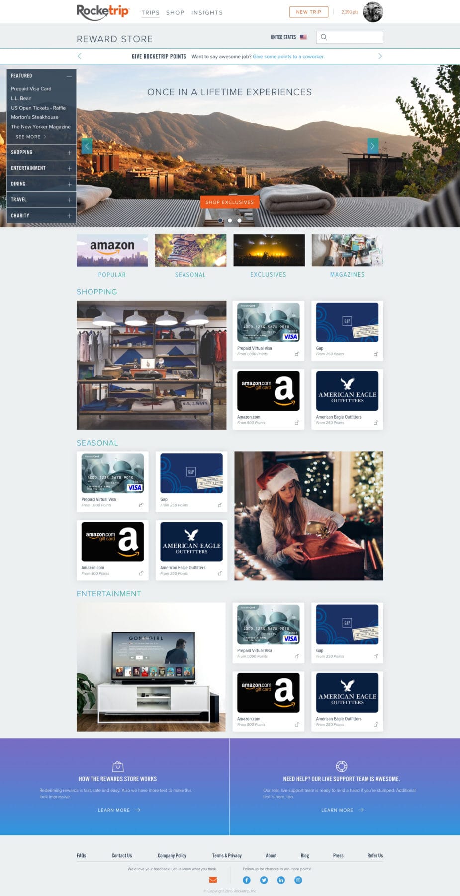
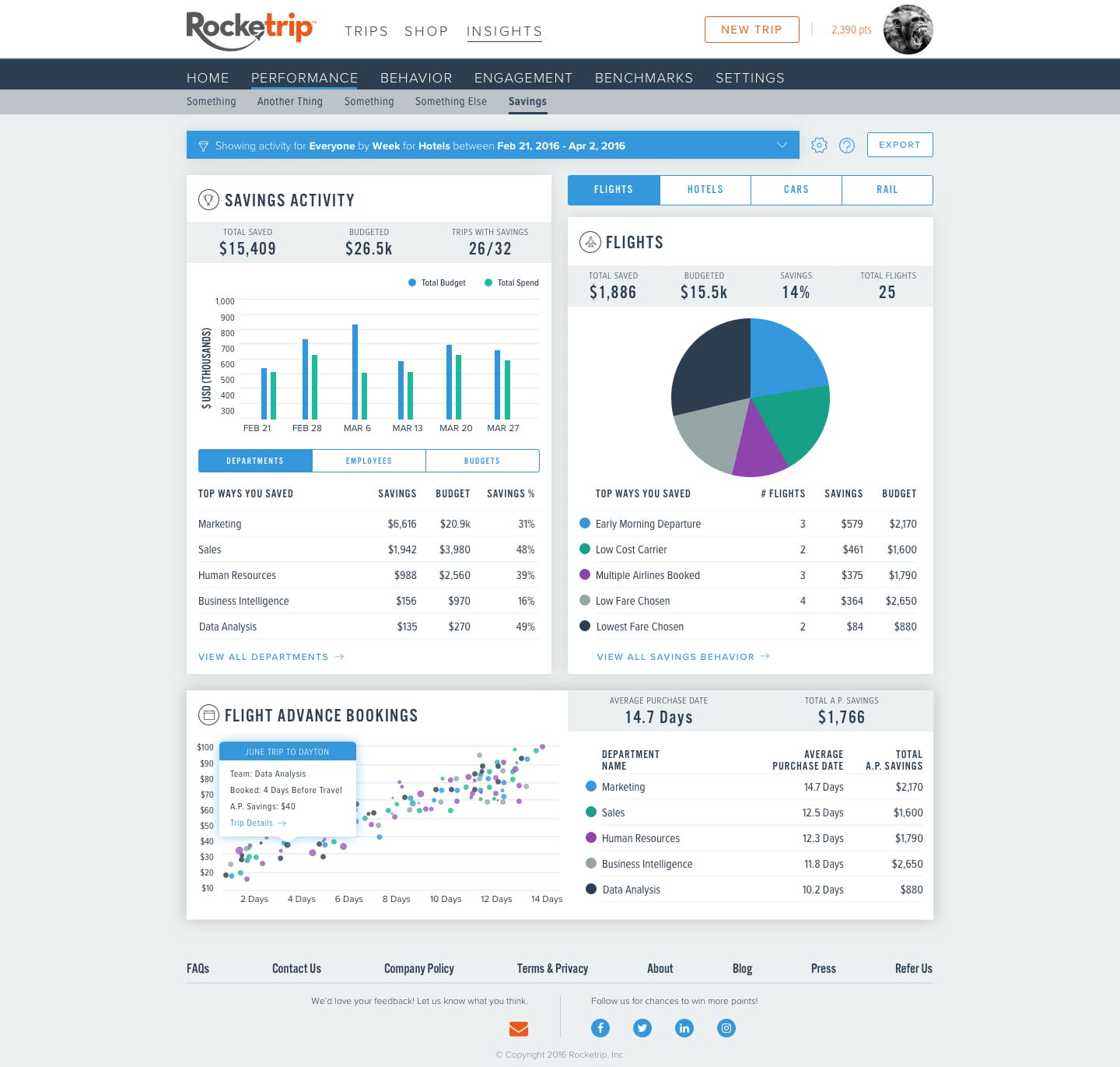
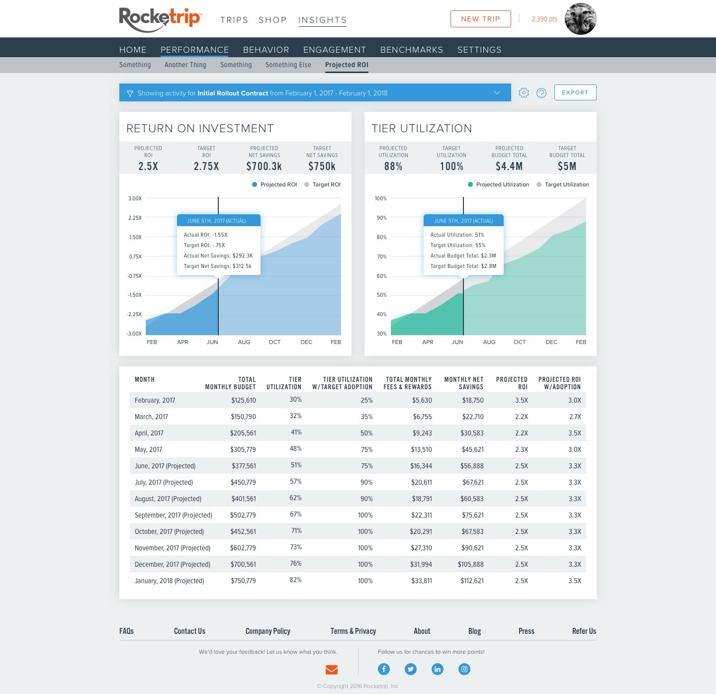
Final Designs
Here are a few of our final designs. The addition of a second font, toning down many of the more dramatic colors, gradients and icon usage in previous versions finally led us to a design that we were happy with. It’s flexible, clean, professional yet approachable, and provides a great foundation for everything from Data Visualizations to emails.


 copy")


 copy")
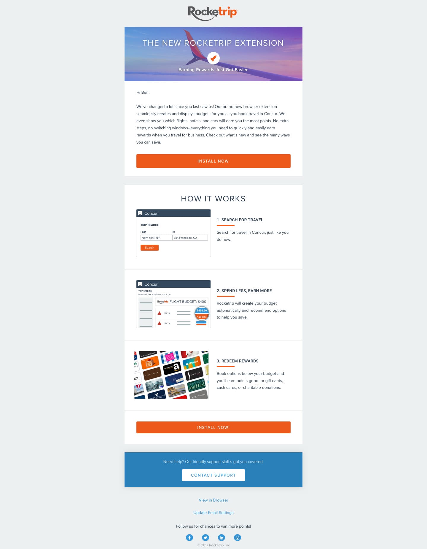
Phase 5: Build It!
As design had been winding down, the development team had been busy, moving the application from a legacy framework to the more modern React. This was essential, not only to improving performance but for supporting a true design system. With a single source of truth for each style and component, it was easy to apply designs across the platform.
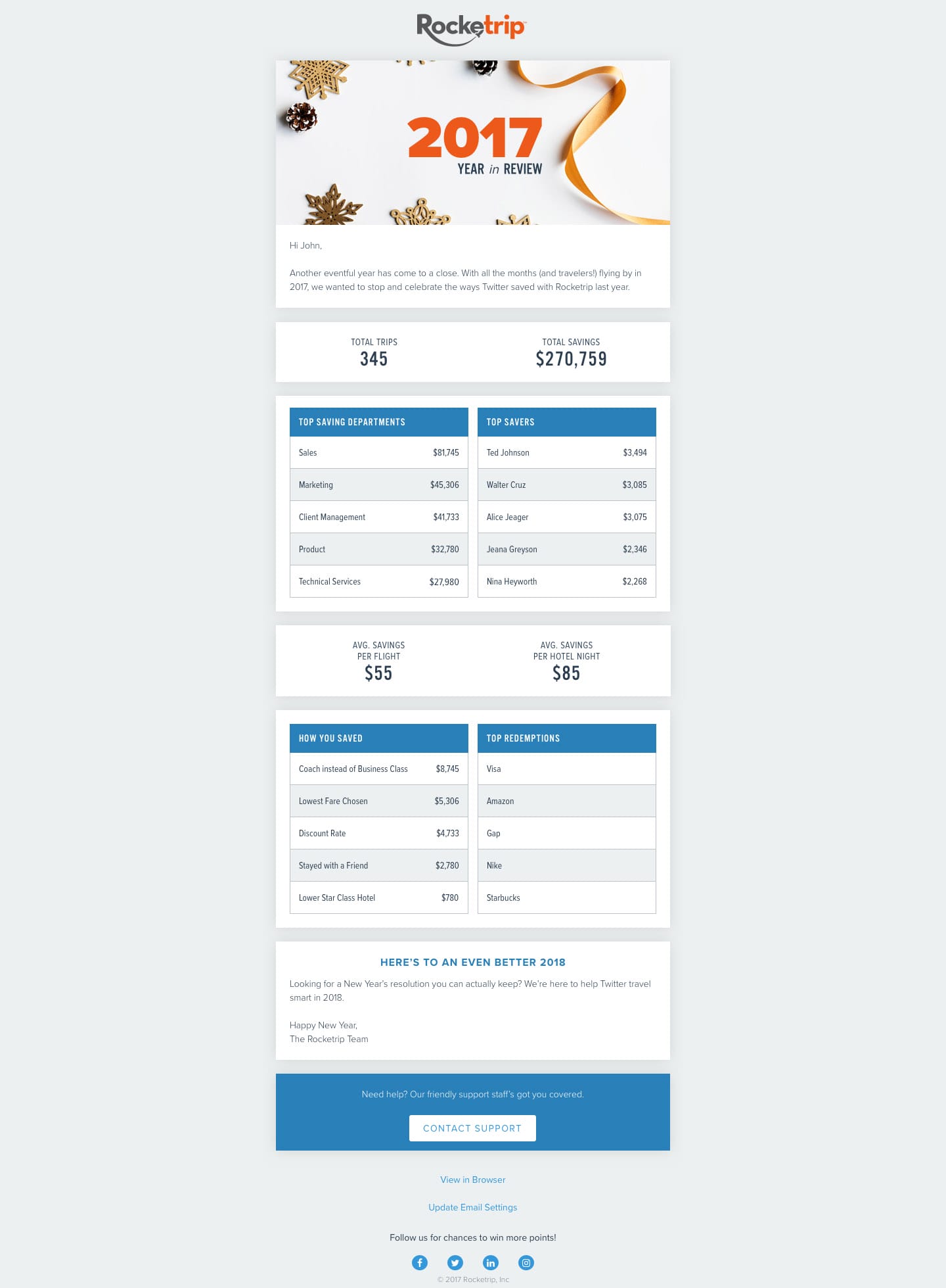
As the team began implementing the design, we invariably discovered edge cases, components, and elements that hadn’t been considered. In addition to working on these, I also whipped up a number of “empty state” images to provide help and character when there was no information to display.
Some of the empty-state illustrations I designed and animated
Wrapping Up
This was an intense project, spanning 6 months, from kick-off through build. And while we’re proud of what we’ve accomplished, we’ve only just started down the path of design maturity.
Over the course of the project, the team gained an appreciation for how the UX process can not only result in a great product but help make everyone’s life a little easier. Going in, we discovered that each department had a slightly different perspective on who the company was, its priorities, and what challenges were facing it. This cross-discipline team not only allowed us to complete a successful project but created alignment across the company.
On a personal level, this project tested virtually every skill in my toolbelt. Wrangling large project teams, pitching to executives, winning over developers, researching, wireframing, mood boarding, prototyping, usability testing, branding, visual design…there were lots of twists and turns on the path to success.
What’s next? Well, you might have noticed I left out mobile designs. It wasn’t accidental! Mobile design was part of the project but is still a ways out on the roadmap. We’ve got some exciting things for small screens coming in the future and I can’t let the cat out of the bag just yet.
The platform has come a long way in this short time, but it only represents a start. Rocketrip is still growing up, establishing itself, and branching out in new and exciting directions. Design has to grow along with the company; it’s a living, breathing entity, with many owners and stewards, supporting success and challenging people to up their game.
Project Stats
34
%
Decrease in user support requests
188
%
Increase in travel through the platform
45
%
drop in average user booking time