Year
2013
Roles
- UX Researcher
- UX Designer
- Visual Designer
- Project Manager
Deliverables
- Research
- Wireframes
- Interaction Design
- Requirements Doc
- Visual Design
Project Breakdown
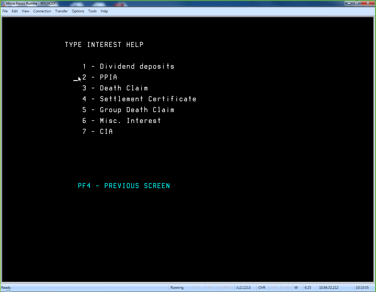
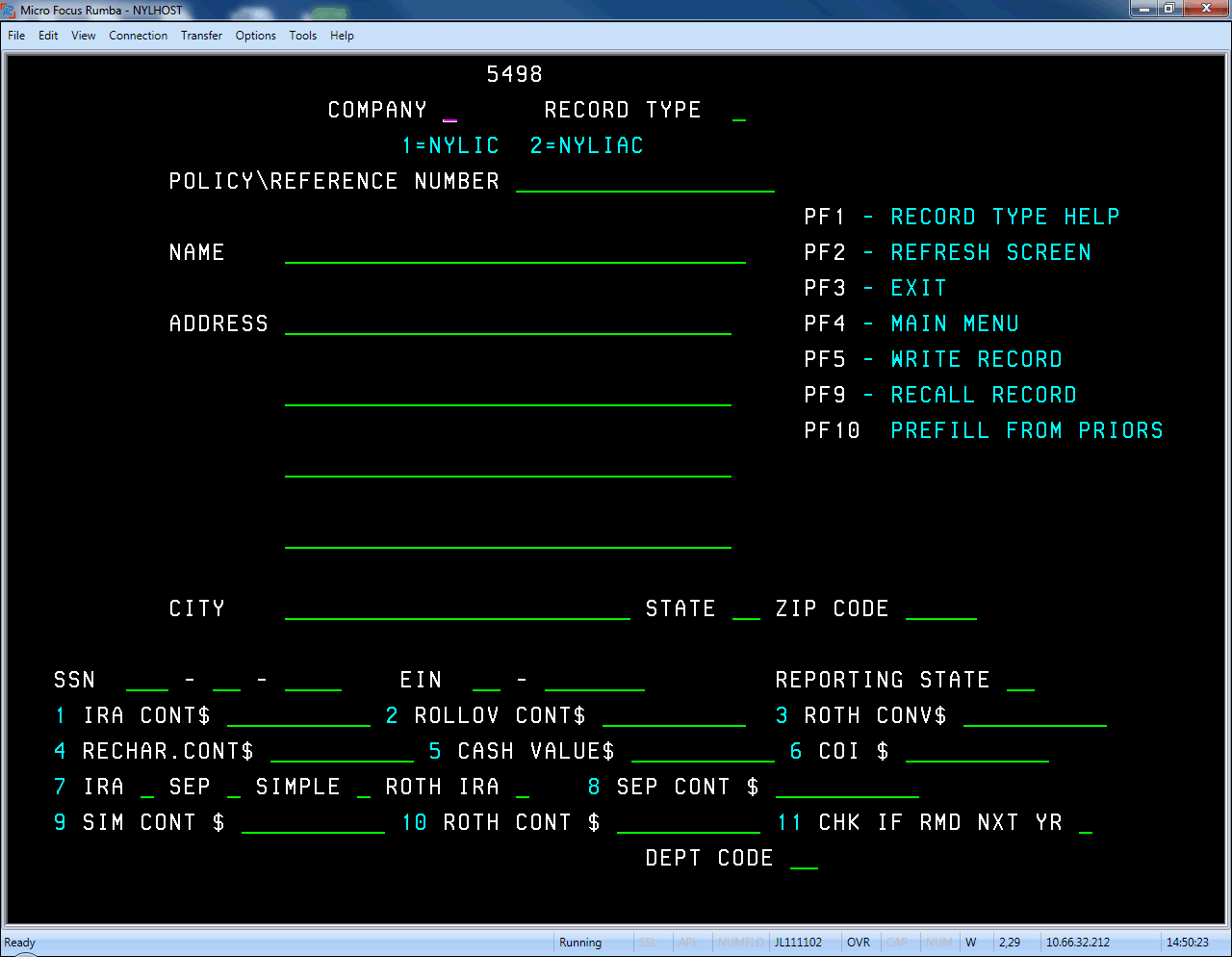
New York Life has a tremendous number of legacy software programs, each for various niche purposes. TXFM was an old green-screen system created to help Customer Service Reps enter tax information from clients. It had puttered along for years without much attention until some regulation changes prompted the company to make some updates. As part of this update, the team was interested in adding some much-needed usability improvements, which led them to my team.
After a number of successful projects, the UX team had gained some minor internal fame. I led the project, overseeing (and carrying out) most of the research, design, and project planning while overseeing some junior team members.


Where We Started
The old system was, to dramatically understate things, difficult to understand. In fact, it took so long to train new users, that very few Customer Service Reps used it–instead, each team had nominated at least one person who would deal with everything Tax related.
The only way we could hope to solve this problem is with extensive, hands-on research.
Step 1: Research
I was fortunate to be working with stakeholders who were committed to the UX process–and this proved to be invaluable to the project. After a high-level walkthrough, I organized three days of sitting with Users and observing them process tax changes, then conducted interviews with 10 different power users in New York, Austin, and Minnesota. The issues we would need to solve quickly immerged:
- The system lacked any kind of in-line validation–essential for cutting down on user-error.
- The system lacked any smart-prefilling functionality. Users had to enter identical information multiple times or enter information that could be populated from other systems.
- Searching was slow and painful–users had to search by exact policy number (no partial matches!), something few customers knew off the top of their head, making it difficult to pull up customer information on the fly during a phone call.
- It was tough to track changes made–when users called it, it Customer Service Reps wanted to be able to see a complete list of changes made to a tax form so they could walk through it with the customer.
- The UI was terrible.

Step 2: Early Ideation
Before undertaking the formal wireframing, I assembled some of the Subject matter experts and the design team for a few days of ideation. We talked through the research, the user flows, looked at some examples from various sources, then did some sketching exercises.
Eventually, we settled on a framework that we thought would nicely support the functionality we wanted. We would test it as we did our wireframing.

Step 3: Wireframing
I set up a recurring meeting three days a week with the Key Stakeholder (also the product owner), developers, accountants, subject matter experts and a junior designer. Each week we tackled a new form the system would need to support, align on requirements, then start sketching out ideas about how to turn it into the easiest to use UI. By the end of the first meeting, we had most of the key requirements and a few different ideas for how to design it.
Then the design team went back to turn the sketches into wireframes which we brought back to the group for the second meeting. In the second meeting, we looked at the wireframes and critiqued what we thought needed work. After the second meeting, we typically had enough to create one or more prototype which we would test Friday morning.
The Friday meeting was used to review the findings, talk about any additional adjustments that needed to be made, and/or sign off on direction.
Some forms were small enough that we were able to tackle two or three a week, so within 6 weeks or so, we not only had all our wireframes, we had a fully functional prototype that had been repeatedly tested by users.
Step 4: User Testing
The wonderful thing about the cadence we’d established is that user testing was simply part of the requirements/wireframing phase. It wasn’t tacked on at the end, necessitating a huge round of updates and additional meetings where stakeholders had to remember what we’d talked about 6 weeks earlier–we worked on a form, tested the form, then updated it before we moved on to the next one.
It also meant that we were free to test multiple approaches to problems, so even if something tested well one week, we might change something up the next time to see if there better solutions out there.
Two findings, in particular, stand out to me:
The first: we had introduced a sort of “Timeline” feature on the new dashboard that allowed users to quickly pull up forms they or their teammates had updated. However, even though users were able without prompting to identify its use, they still attempted to search for a record they had just changed. Over and over again.
The solution turned out to be elegantly simple. When users returned to the dashboard, we waited a moment, then created an animation where the new record faded in and the others slid down. As soon as we added this animation, users immediately began using it to access records. My guess is that it not only added a subtle reminder but helped the users understand that it was dynamic.
The second major finding we discovered had nothing to do with the TXFM system and reminded me about the importance of understanding the bigger world in which software must live. On an especially complex form, we discovered that users had an incredibly complex approval process:
- Users would print a screenshot of the old record,
- Users then entered the proposed changes and printed another screenshot
- Users would send the print-outs to their managers or approval.
- Managers would review the records, then send them back to the users.
- Users would then forward the approved screenshots to New York Life’s accounting department
- Accountants would review, approve, then mail them back
- Users would pull up the record in TXFM, enter the information all over again, then submit it.
When we actually sat down with all these different people, however, we soon learned that the process was not only incredibly time-consuming but completely broken. Managers were typically not well trained on tax regulation or the system, so they almost always signed off any approvals that came across their desks. The company accountants, meanwhile, weren’t reviewing the records for approval–they simply needed to add it to their tax-tracking.
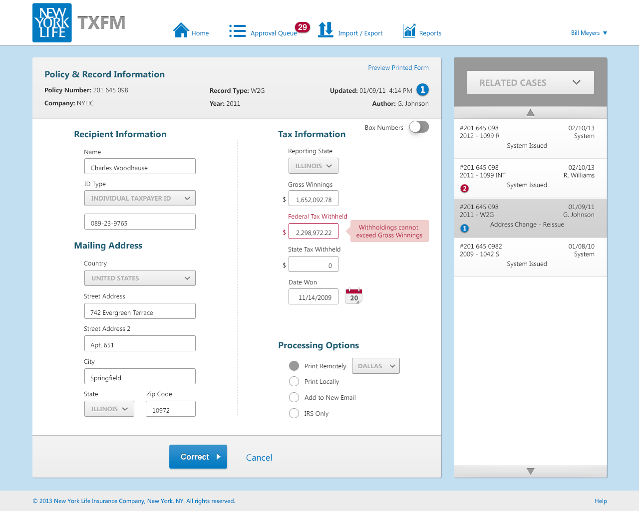
We solved the problem with an automated approval queue–managers received updated records that required their sign-off and were able to look at highlighted fields with help explaining what they should look for. When they approved, the record was automatically saved and a copy emailed to the accounting department. But we never would have noticed this thorny issue if we had just talked to users, rather than tried to understand the entire ecosystem.
Step 5: Design
In order to give the team an idea of the direction we’d take for design, I created a simple mood board outlining some of the principles I wanted to convey: Clarity, Simplicity, and Approachability. However, it was important that it still inherently felt like a New York Life branded application.
In addition to experimenting a bit more with color usage, I made the decision to exaggerate most of the app controls (form elements, buttons, etc.). This second choice was less about aesthetics and more about creating large targets for users who tended to be on the older side and often needed to be able to operate quickly while on the phone with customers.


Outcome and What We Learned
Unfortunately, at the time when we would have begun ramping up development, the project was placed on hold so the team could work on a more urgent project. However, given the significant user testing the new design was subjected to, I’m confident that it represents a significant improvement.
I’ve already described some of the findings that user testing uncovered–but they represented large lessons that I’ve taken to heart:
- Movement is a whole dimension that needs to be considered on top of content and design. When used thoughtfully, it can provide usability and clarity that can mean the difference between failure and success.
- Never forget to consider the ecosystem in which your design will live.
This was, in retrospect, a thoroughly enjoyable project–which is probably surprising, given the very dense material and specialized functionality of the application. However, the process was not only incredibly rewarding but interesting too. The amount of time I spent talking to and working with the end users made it impossible not to feel their pain, to try to understand their struggles, and to push yourself harder to create something that would improve their lives just a little bit.
